Wednesday, October 24, 2007

logo design


This is part of my freelance work. This logo i designed for my hip hop artist client. The whole idea was to have his letters and image spell out his name in silhouette format.
It was quite easy to create as his name fits in easily with the whole image. It was just a matter of getting one of his photos and working on it. I used illustrator to create the whole logo.
This logo was to be applied on different print media including posters and t-shirts so I figured using black and white was the best choice as it would work with any color.

wallpaper option1


This is a continuation from the logo designed for my artist. I decided to create a series of wallpapers for him which he's also used for promotional posters etc.
This particular wallpaper has a military feel to it because hip hop is basically about the competition who is better than who and whose rhymes are more powerful. working on these wallpapers was quite fun as he didn't really limit me in anyway.

wallpaper option2


This is another one of the wallpapers design for this artist. This particular wallpaper was focusing on the whole music theme especially hip-hop.

Tuesday, October 23, 2007

kiddies page

The magazine that I work on has a page strictly for kids the aim is to teach the kids a certain lesson or scripture through a series of games. On this fun page I decided to play around with shapes as I realized that the previous fun pages were very dull and formal for kids.

We created a little character (top left) who basically introduces the scripture for the games and basically sums up what the page is all about. I also chose to make it as colorful as possible because the target audience is 5-10 so at that age most kids view things according to color, the more color the more they are interested in reading and participating.

Designing this page was fun as i had never really designed anything specifically aimed at this target market before. Although my boss had a bit of a problem with the colors I convinced her that it was the best way to attract the children's attention and keep it there.

website layout

This is a layout for the different partnership arms in the church, it's basically to teach people about the different partnerships. it gives options like giving online and also provides links for other sites related to the church.

The layout was design to be simple and very user friendly, the main links are all rollovers and keep rotating so one is able to get to a certain link by rolling over it and clicking hen you click it becomes the main page bigger, visible and legible. Alternatively for the convenience of people who might find it harder or not user friendly I have provided the option of clicking on buttons running across the top of the page.

I choose to work shades of blue to give it a very calm and relaxed feel. I was ultimately going to use blue only but they insisted that I add another color. I decided to use purple as its one of the colors on the Church logo so it doesn't seem to be out of place.
This was very quick and easy to do the only thing that I had to figure out was overlaying the shape layers.

Friday, October 19, 2007

dvd ad and review

This design was was for a DVD ad and review to go into the magazine. the whole purpose of the page is to inform people about a promo DVD. The whole layout I decided to use the film to go with it being a DVD. the colors I chose were to match with the DVD cover to avoid using too many colors which might clash. The quote on the side is just a snippet summrising what the DVD is basically about. Its in italics obviously to put more emphasis and differentiate it from the body copy. the body copy is in blue because I chose to work with different shades of blue instead of having black or white for the text and of course it's still legible.
I believe it's a successful design because the DVD image is quote big and clear and the type flows and gels with the whole design.

pages for article


This layout I designed for an article to go onto the magazine. It was a report back on what the service was all about so I decided to use photographs from the service. I decided to make very minimalistic to ensure that there's still enough space for the article, however as I was not allowed to leave the page white I decided to add a bit of green on the edges to match with Pastors suits also in the green I added type to emphasize on the concept of a word mission.
all in all this I believe was a successful design concerning the fact that it's for a church magazine whioch adheres to a certain type of look.

envelope


This design was for the church's partnership envelopes which are used for donations, this particular one was for 'the American Initiative' a project aimed at starting a church in America.
Working on it was quite easy as the church already has a format they use for their envelopes so I had to give it th American feel. I chose to work with the American colors red, blue and white to represent America.

Wednesday, June 6, 2007

flyer

this is flyer designed for a youth convention/ music concert for church.

I basically just work with different transparency's to achieve a certain young interesting look and feel.

flyer

this is flyer designed for a youth convention/ music concert for church.
I basically just work with different transparency's to achieve a certain young interesting look and feel.

Tuesday, May 15, 2007


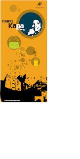
this is a poster that would hang inside the mall.
I forgot to mention thay insisted on having some sort of product offered to be shown on their ads hence the bags and so on.

maponya mall ads


this was a taxi branding ad as most of the people who will be coming to this mall use taxis as a form of transport.
It's basically carrying on the same concept as the billboard.

billboards


this is work i recently did for a brief to brand a new mall being built in Soweto called Maponya Mall. I basically had to design ads billboards and posters to brand the mall.


they want this mall to be the sandton of soweto but with its own identity.


so i chose to use an illustrated feel to creat an identity unlike most malls which tend to use photographic images.

the concept behind the billboard is 'mang kapa mang' which means anyone who's anyone. Basically this is a mall for the people of Soweto which is a very big market on it's own. I used this phrase because it's easily understood by people in Soweto as opposed to English which could prove to be a problem since not everyone in Soweto is literate.


the images I used were just mock up images as they were to chose what images they wanted I just had to give them some form of layout.


They wanted neutral colours but I decided to play around with other colours just to see how it would turn out.


this is a flyer i designed to advertise furniture for my previous employer at meropa heritage.

brochure design


this is the work i sent to your email from my previous work place.
were you able to get hold of my employer?

Wednesday, April 25, 2007

reed dance

front

back
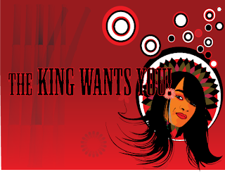
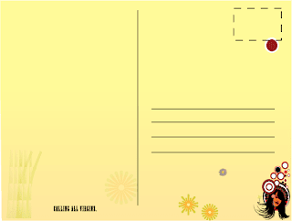
This is a post card I designed as part of my Reed Dance campaign.
Te reed dance is part of my culture and it's been going on for years. It's a ceremony where the king gets to choose a new wife amongst Thousands of 'virgins'.
This campaign is something that would run a month before the reed dance and it can be seen as being for or against the reed dance, as people who want to be chosen can feel like it's talking to them directly but then again there are some of us who respect it but think it has lost it meaning to our culture.
This is definitely a Fun exciting project as I am working with a personal thing and voicing out my opinion.
The Design:
This is obviously all done in illustrator (love it!). I took an image and traced it not live trace but actual tracing with the pen tool this way i get to feel like I have some form of control.
The colours red,black and white are the Swazi National colours that you would see if you were to attend the reed dance as our traditional gear is red,black and white.
I obviously once again insisted on using blend I feel it works well with absolutely anything and everything (I stand corrected.)
The red in front of the card also symbolises Passion: passion the girls have for attending and being part of the reed dance and most importantly the passion the king and all the other men have watching the reed dance.
The circles around are smaller putting emphasise on YOU and how you will look amongst all other maidens.
"The King Wants You" is based on the propaganda or war posters. I chose to write it in black and outline it red beacause black is quite a bold colour like our very bold king and the red ouline is to represent his "hot blooded passionate manner".
I am still experimenting with the reed, if you look closely you might see it in the left hand corner of both the front and back.
The back of the card is a blend from white to yellow a symbolism I used to represent the purity before and after the king gets you. At the bottom I have the words "Calling all virgins!" as the reed dance is meant to be for strictly virgins (king can't dine where another man has dined!).
Obviously if I was to publish this in Swaziland I would most probably get arrested but design follows no rules.
Look out for more from this campaign.

Spa Life

outside

inside

This I did helping a friend who's studying health and wellness or reflexology?
He was meant to come up with a price list for his made-up spa. So we came up with a simple name "Spa Life".
Being the designer that I am I decided to turn his price list into a brochure. I worked with an off white and blues as I believe them to be calming colours and I felt that they worked well with a Spa. He wanted bubbles everywhere so thanks to my blending once again I gave him bubbles.
It obviously was not meant to look like it was professionally done as it was just a class exercise so I decided less is definitely more in this case.
I found pictures which related to what he was selling and designed it in such a way that the product is next to the price so as a client you know what you're getting.
All in all it turned out fine and he liked it but given more time I would have worked more with the layout of the pictures as some of them look more like they've just been pasted in and don't form part of the whole design. But for a day's work I say it turned out okay.


Plasticism

Before


After

This is an experiment i did on photoshop (first photoshop experiment) called plasticism.
After realising that I haven't done enough experimentation with photoshop I decided to start with the basics.
I played around with the contrast to make the image darker and easier to work with. Then I cleaned it up using the smudge and paint brush tools. I enjoyed this because as I worked onto it I realised that it started to look more like a painting (the face that is) so in future I would like to actually work on a photograph and make it look like an actual painting, should be fun.
Yes Onica photoshop is amazing!


one insurance policy

This is by far the worst logo I've designed!
I designed this logo for an insurance company which covers all areas of insurance from house to life insurance. The main objective was to make it a "united" logo to stress it being No.1 and all in one.
The colours are the company colours.
Working on this logo was very difficult as I was working with a difficult client who would not listen to a word I was saying. For a person who claims to be competing with companies like OUT SURANCE he doesn't what he's talking about anyway that is besides the point.

I quite like the fact that it is sort of iconic and I loved experimenting with the whole 3D look, which I must admit was quite a mission until I came across ctrl+alt+B i.e Blending it worked like a charm hence the reason why you'll be seeing a lot more of it in my work. It also made my client happy because felt it was exactly what he was looking for.

The main reason why I hate this logo is because every time I look at it I feel like I've seen it somewhere before so guess that's a big fat zero for originality!

logo design


This is a logo I recently designed for a record company called "slam records".
This company is for young and upcoming musicians mainly in the 'hip-hop' genre.
It's based on their existing logo using the record. My task was to have the type and image work together to convey the whole slamming message (exact words from my brief!).
The image is a slammed or smashed record as they insisted on it, the typeface I chose to link with hip hop culture of graffiti but also thought it could mean they're making their mark like graffiti artists do.
I chose these colours because they work well together and for something that will be printed on CD covers it's not too bright which could distract the design on the cover. Most importantly red and black is my theme this year.
Working on this logo was quite fun and easy, I would have loved to have it look more abstract (which I did) but my client insisted on sticking to the image of the record being the most recognisable item.
on that note, would you like me to post different variations on work that I do for the same thing or is the final product just fine.

Tuesday, March 20, 2007

logo design (kopano travel)

Jan 1-7(week one)

This is part of my freelance work my first job out of college. It's a logo I designed for a traveling/tourism company
called "Kopano travel".
Working with the idea/concept of travelling I used a stylised road(the line leading to the name). The colors the client picked out not too sure if I agree with them really(but the client is always right!)right?. I would have liked to work more with earthy colour or just simple shades of brown, speaking of which how far do we push the whole idea of the client 'always being right?'
I did however enjoy designing this logo because I worked with gradient and drop shadows, something I hadn't
tried out in any of my designs before.
Maybe because gradient is sort of frowned upon in Design Center, none the less it's always great to try something new and discover that it actually works or does it? I'd like to hear your views and comments on this one.